ChapStick Transformation
The Challenge
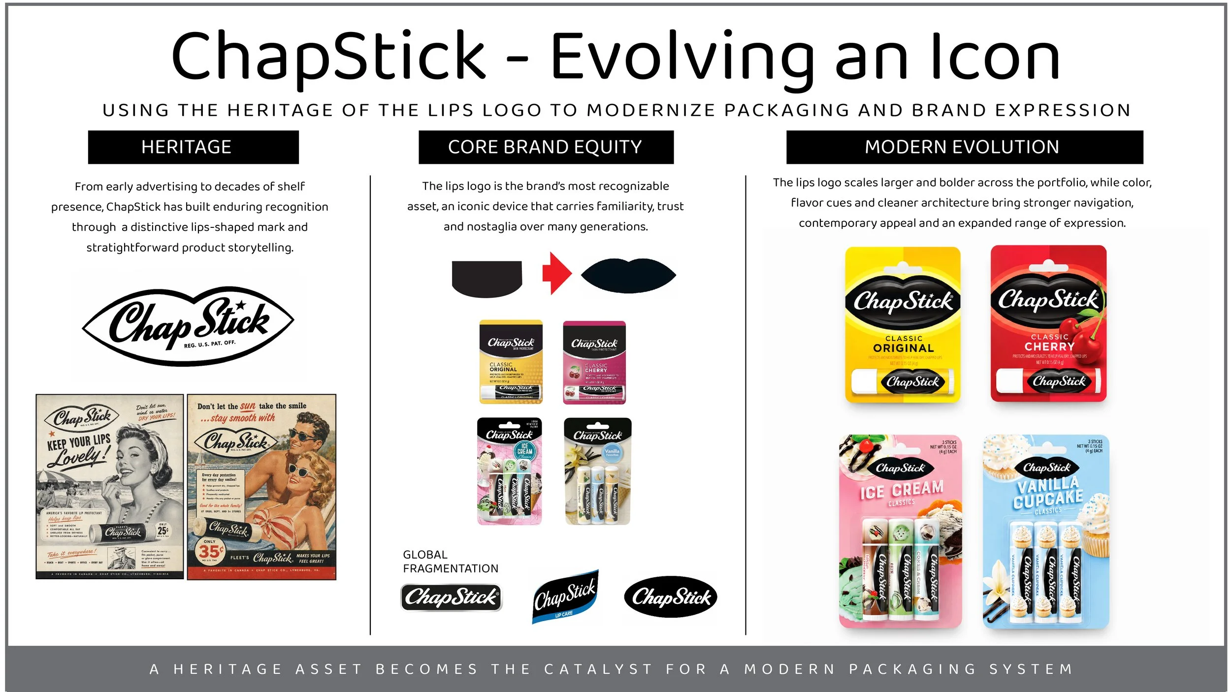
Unify ChapStick’s fragmented global identity into one clear, recognizable brand system.
The Strategy
With more than 140 years of heritage, ChapStick had earned iconic status—but inconsistent packaging and differing brandmarks across markets, including the U.S., had diluted its global presence.
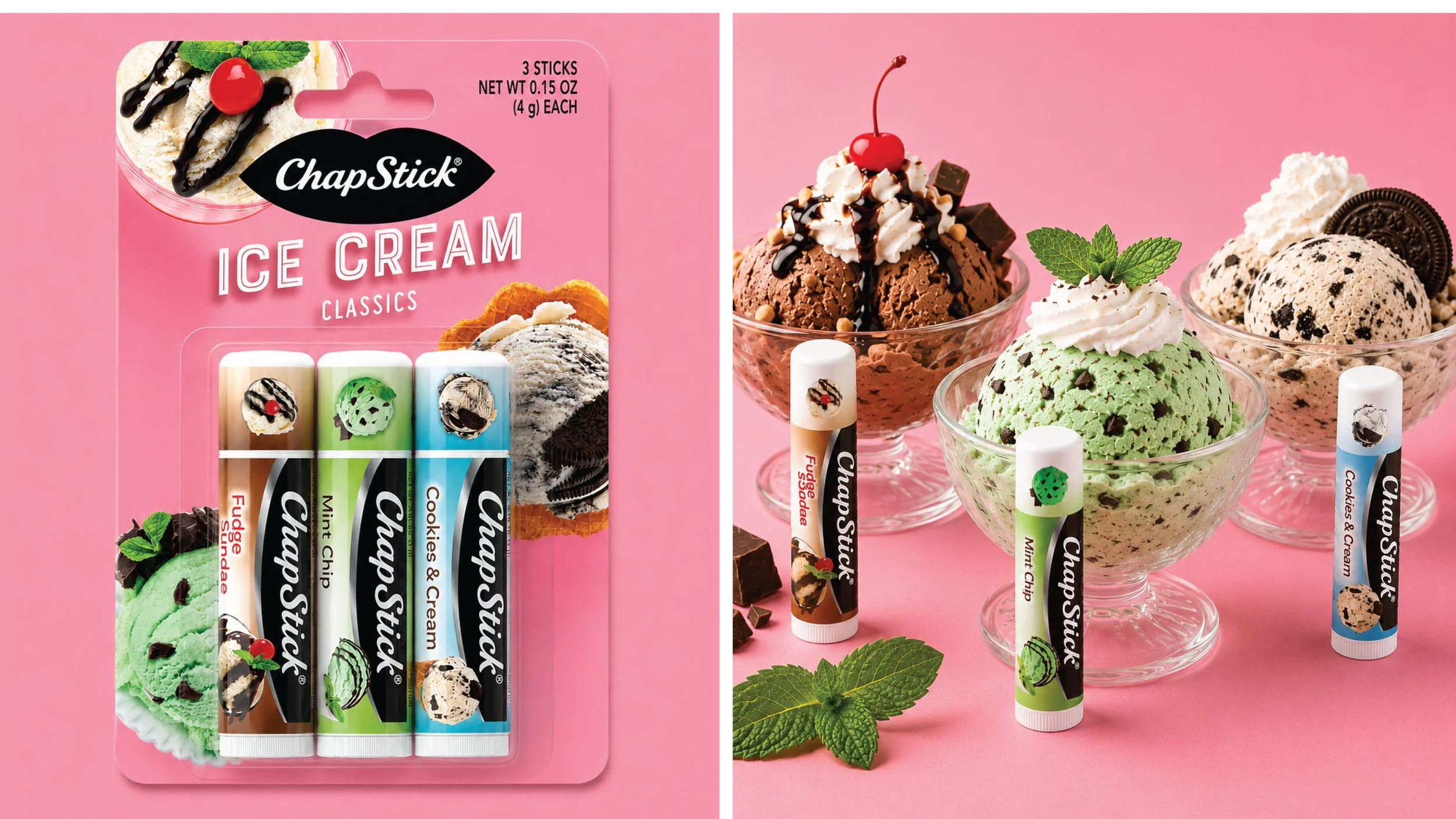
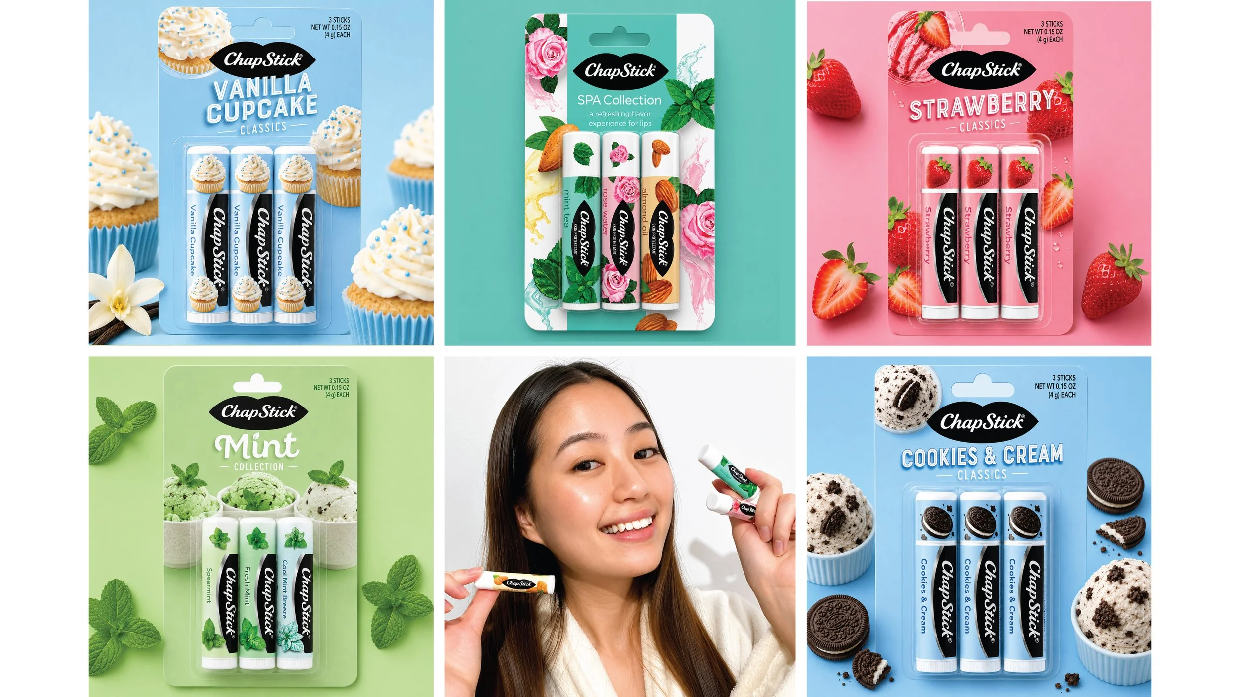
The lips logo became the unifying brand asset, reconnecting the portfolio to its distinctive heritage. Paired with a clean, contemporary expression of flavor, the refreshed identity creates a system that feels both unmistakably ChapStick and relevant for today.
The Impact
Re-established a consistent global identity system for a fragmented heritage brand.
My Role- Global Design Strategy, Brand Identity Unification, Portfolio Architecture, Flavor System Development, Brand Asset Governance, Packaging Development, Agency Direction, Production and Color Consistency.
Output- Packaging, Brandworld, Reusable Templates, Ecommerce assets, Brand Website, Design Guidelines, Launch Toolkit, Launch Advertising.